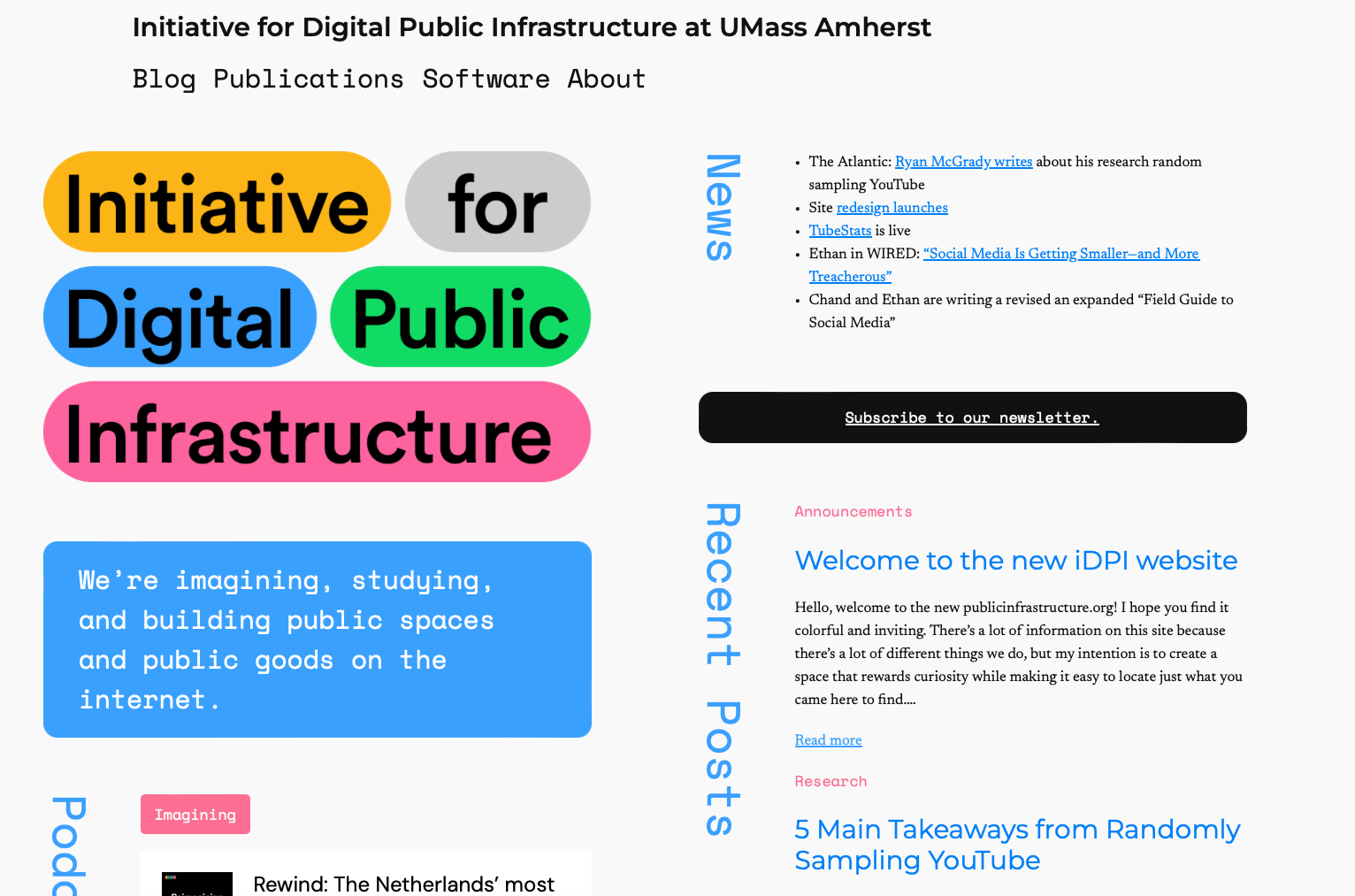
Hello, welcome to the new publicinfrastructure.org! I hope you find it colorful and inviting. There’s a lot of information on this site because there’s a lot of different things we do, but my intention is to create a space that rewards curiosity while making it easy to locate just what you came here to find.
We’ve needed a site redesign for a while. The last one is something I got from hacking the blocks functionality in the WordPress Twenty Twenty-Two theme. It looks nice for a while, but somewhere along the way WordPress and that theme got updates that made everything kind of fall apart.
Our lab is pretty idiosyncratic, and designing the right website for it was a bit of a challenge. We’re an academic lab split across three different departments (computer science, communications, and public policy), so our output includes both software and journal publications. We also feel the imperative to translate academic work to the general public, so we really prize our podcast and our blog.
That’s a lot of different types of stuff to direct visitors to, and then on top of that we have so many different categories of things we focus on.
And then the reason for this site redesign in the first place was that our blog was a dreadful reading experience. Ethan and Chand want to publish drafts of chapters from their new “Field Guide to Social Media” on the blog so that people can comment on them with feedback. Poorly laid out blog posts don’t really communicate to people that you should really be trusted for your expertise on how the Internet works.
My ultimate goal was to present a nice website that actually shows we are literate in how people experience the Internet while also doing justice to all of our lab’s excellent work. Let me tell you a bit about the decisions that went into accomplishing that.
Readability first
So, since the first problem I was solving for was legibility of our blog posts, I started with a question about how to best represent texts on our site.
Early in the redesign process, Nielsen Norman Group published a fascinating set of findings demonstrating the multitude of problems with so-called “mobile-first design.” In that paradigm, websites are designed primarily to be viewed on smartphones and tablets, and the desktop version is an afterthought. The study ultimately ends up arguing that this creates an especially poor readability and navigability experience, and runs afouls of several accessibility principals in the process.
It calls the effect “content dispersion”: basically when you design for a smartphone and neglect the desktop, everything is a weird size and in a weird place in the desktop experience. That was our old blog in a nutshell. Text was floating in whitespace, header images were grotesquely large, and a blog-roll-style approach to the podcast archive that made it practically impossible to find old episodes.
So the imperative for this redesign was to make everything feel orderly and grounded no matter what kind of device you’re using. I chose to design a layout with strong columns that keep things on pages well organized enough to direct the eye, even when there’s a decent amount of information available.
Design Process
I mocked up wireframes of pages in Figma and then passed those around for feedback in the lab.
I then used WordPress’s new site building tool Gutenberg via the Twenty Twenty-Four theme. It seems to be their take on WebFlow. Gutenberg allows a lot more design flexibility than anything WordPress has offered before.
That said, the flexibility often felt like a half measure, and Gutenberg got in the way just as much as it allowed leeway. I’m not sure if this is the result of the WordPress team’s assumptions about how much control a user would want over their design or if it’s a quirk of trying to build next-gen theming tools in a PHP framework.
But a lot of times I found myself just craving the ability to do my own CSS and HTML on a page level. You can edit HTML directly in blocks, and I did sometimes, but that means you forfeit the Gutenberg toolset to position items and usually loose the WYSIWYG visual feedback. I never managed to get the “advanced CSS” classes tool to work, seemingly because of an algorithmic CSS inheritance structure that gets imposed when WordPress translates its style sheet to blocks.
Honestly, I’m pretty certain two out of any given three hours I spent working on this design were dedicated to ironing out kinks Gutenberg introduced.
Visual Matter
We have a great color pallet thanks to wonderful rebranding work by Dario Stefanutto and I wanted to make tasteful use of that where possible, since so many academic labs’ websites are so staid feeling.
There has also always been a challenge with present imagery on our site. There aren’t a lot of good photos or illustrations you can if you want to talk about the Internet in a new way. There’s stock imagery of cables and glowing computers that feel straight out of an ad for a cloud computing company, and then there’s the dreaded flat illustration design that screams “millenial” and “start up” in the shrillest tones. And, for lack of my own creativity, I didn’t want to use a generative AI to churn imagery for the site—that just doesn’t seem to mesh with what we’re about here at the lab.
I think there is good imagery we could use, and we’re still considering hiring an illustrator to supply us with a cache of assets we can use in the coming years. The Markup has put a lot of great thought into visually communicating about computers and the Internet. But ultimately I decided to see how far I could get without imagery.
So I put a lot of thought into a strong font selection, a clean layout, and a judicious use of color. Those fonts, for the curious, are Montserrat for sans serif, Newsreader for serif, Courier Prime as an alternate serif for bylines and sub-headers, and Space Mono for the monospace matter like titles and navigation.
Home Page
The home page took the most thought, since I wanted to give a good overview of what we’re up to at the lab with a minimum of scrolling. But that means that a lot of information would be presented very densely.
I also wanted to infuse it with the candy colors in our site logo to keep it feeling alive and playful.
I decided to treat the two columns on the home page as “vision” and “information” respectively. The left side—our vision—includes all of the media and software that helps us define what we think the Internet could be. The right side—the information—conveys the more explicitly scholarly side of what we do.
Blog and podcast
Since we do have several disparate projects, I devised a new tagging system for the blog that makes it easy to jump straight to the thing you want to read about. This is especially important as we publish draft chapters from Ethan’s and Chand’s new Field Guide to Social Media book for MIT Press.
The blog posts themselves are left-justified and kept relatively narrow to help guide the eye in the browser experience.
Since it was so hard to find podcasts previously, I decided to depict them in a table instead of in a blog roll. That way you can quickly scroll through episodes to either locate a specific one or surf through ones that sound cool to you.
New pages for publications and software
Arguably the two most important pages on our site are the ones that show our research and our experimental software. Each of them was designed in a way intended to reflect content.
Publications is made up of a series of blurbs about our research, formatted to give visitors a higher level overview of each paper, split into categories. These blurbs are also formatted to make citation easy, with title, author, date, publication, and hyperlink to the text all presented explicitly for easy copy-and-pasting into a citation manager like Zotero.
The software page was really driven by a desire to give a sense of freshness and color through simplicity. Layout is based on the common rhythms of using a web browser, while styling was intended to help everything presented feel fresh and exciting. Color and vertically aligned text ad some play and dynamism, fostering the kind of spirit we hope people bring to our software.
Feedback?
The last major piece here is that I’m opening up commenting on our blog. Have thoughts about the new redesign? Sound off!